Why Comic Sans is a GOOD THING.
Hear me out.

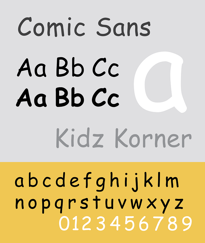
While pretty universally derided as a BAD THING in the world of design, Comic Sans — yes, that parody of a font — is actually amazing.
It has been given a hard time by designers, banned by a model parliament, and become something of a nerd’s go-to April Fool’s joke.
Take a closer look at this typographic fiend, though, and you’ll discover a font far more interesting than most.
For starters, Comic Sans, created by type designer Vincent Connare in 1994, is designed to be disambiguous — that is, every letter is unique. Letters like b and d, or p and q, aren’t simply mirror images of each other, unlike in more regular fonts such as Arial. While emulating a handwritten feel, it also means those with reading difficulties can distinguish individual letters easily.

A fantastic piece by AIGA Eye on Design says it better than I can, and the fact the British Dyslexia Association recommends Comic Sans in their style guides for dyslexia-friendly text speaks for itself. Vloggers VSauce also have a fantastic video on the subject.
One may argue that the point of fonts is to be readable (Wingdings and other dingbat fonts excluded, of course), and in this way Comic Sans goes above and beyond. The irregularity of its composition and the variation in letter height make it particularly readable for those who suffer from reading difficulties.
Comic Sans was also part of a study by Princeton University which showed that the font could literally improve your memory. The study tested how the readability of fonts affected schoolchildrens’ retention of information, and Comic Sans was part of an irregular font set used; the regular font set included Arial and Helvetica.
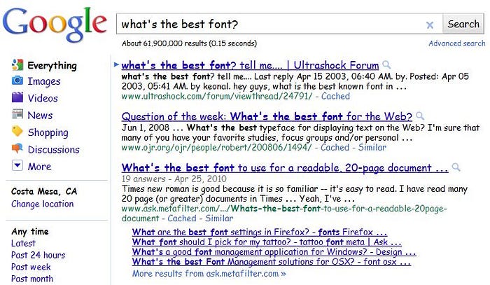
The study concluded pupils spent more time digesting the information when printed in the irregular set of fonts and were subsequently far more likely to remember it in the future. The opposite, that pupils found it harder to recall information presented in regular fonts like Arial, was also true. So if you have trouble recalling information, maybe the answer is changing all your fonts to Comic Sans — like Google did in 2011.

The final reason to love Comic Sans — if you don’t already by now — is that it has its own “day”.
That’s right, on the first Friday in July and largely in the Netherlands, supporters celebrate this oft-maligned font. Created by DJs Coen Swijnenberg and Sander Lantinga, Comic Sans Day is a day to “send all your mails, print all your reports and all your sticker address labels in this illustrious font.” There’s even a Wordpress plugin that automagically changes your website’s font entirely to Comic Sans on the day.
Just imagine if everyone did the same — for a day the entire internet would be presented in a font that is easier to read, and your memory might be that much better off for it.
